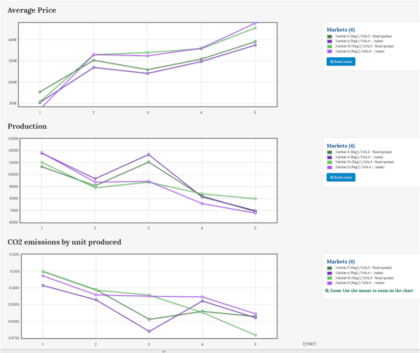
These pictures illustrate the evolution of CO2 emissions in one of the games of our last session at Mines Albi and Dauphine University.
Each line corresponds to a different market with specific environmental policies. The “light blue” line is a benchmark market over which there is no environmental policy. Without getting into details, from year 6, there are tradable emission permits on the three other markets and the cap (the total number of permits to be allocated) decreases by 80% every year (changes from one market to another bear on allocation specifications such as whether or nor banking is allowed, are the permits sold through auction or allocated for free, on the basis of past production or pollution, or else…)

In this first game, all the three policies seem to work pretty well. Still, something interesting is already visible in year 5 (the year just before the introduction of CO2 permits): emissions increase (more or less) in all three markets.
So, what happens in year 5?
Players are aware that permits are to be introduced the year after, and that the allocation in year 6 will be based on historical data (that + other info about the future of the markets):
- On the brown and purple markets, players expect year 6 permits to be granted in proportion to their emissions for year 5.
- On the red market, players expect year 6 permits to be granted in proportion to year 5 sales, but with a global and predefined cap.
So, it is no big surprise to see emissions increasing in year 5 on brown and purple markets. The increase on the red market does not come from a direct incentive to emit more CO2, but still occurs, as a side-product of the incentive to sell more (that, plus a correction of a mistake during year 4).
In fact, this is much more spectacular when you look at the other game of the session: Here the emissions in year 5 were so important that even in year 8 or 9, global emissions in the brown and purple markets were not so different from the benchmark level. The irony of the story is that the player who was the main contributor to this, found himself with many emissions permits, but with permits that were nearly worthless because of their number (later in the game, the permits were partly allocated on the basis of historical allocations and partly through auctions. And enough permits were granted through auctions to make them easily available to all the firms on the market)
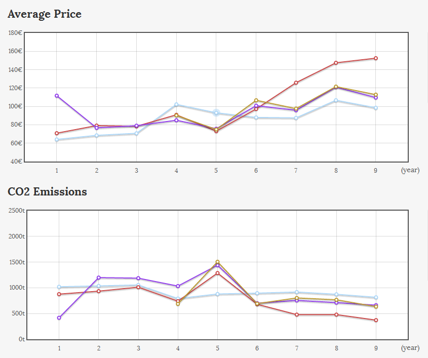
In the next sessions, we will probably also introduce a “better-designed” allocation scheme. Emission trading schemes can perform quite well when they are well designed, but the devil lies in the details (in particular, because of expectations and governments’ commitment issues)


 by
by 

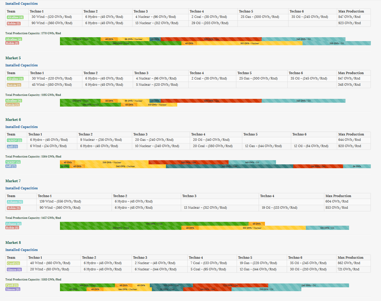 On most markets, total installed capacity exceeds 1400GWh/Round, even though the probability to have a shortage with that capacity is only about 0.6%.